Aphix SalesRep: General screen layout
Introduction
Aphix SalesRep has been designed to be functional and intuitive. The key elements and menus remain in the same place, regardless of what section you are in. Familiarise yourself with the general layout of Aphix SalesRep.
How it fits together
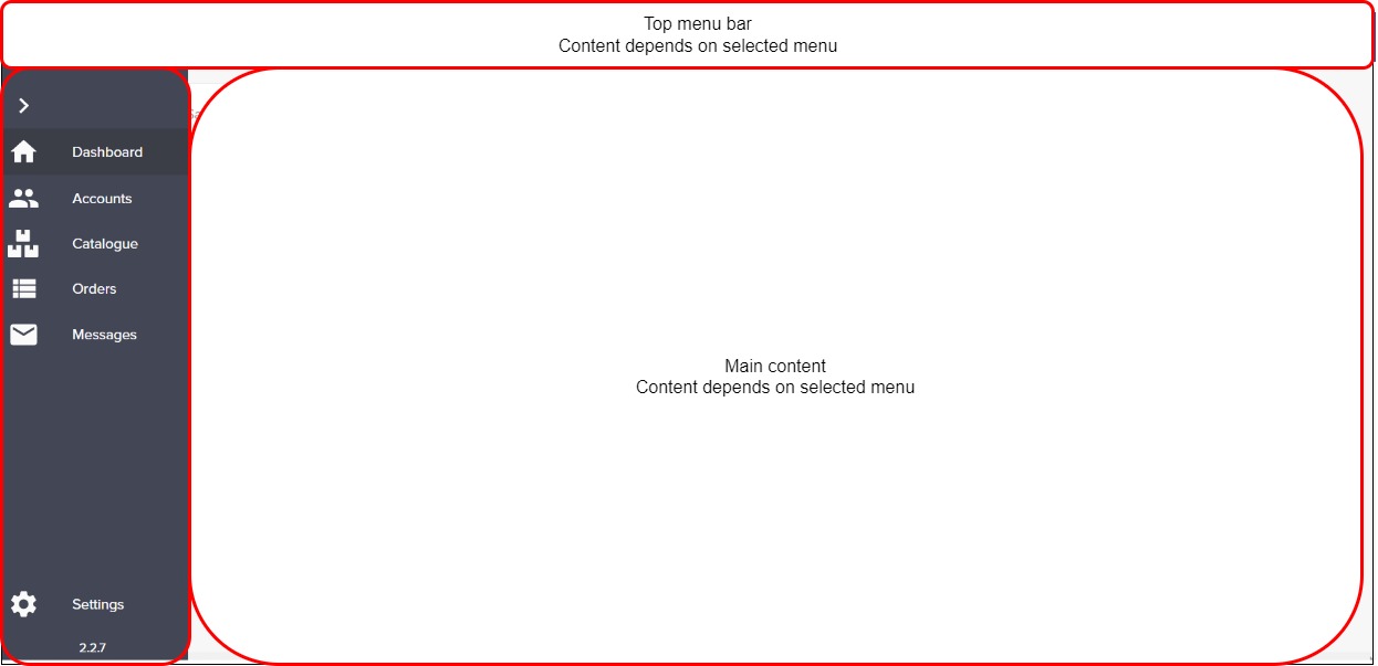
Each screen within Aphix SalesRep has a similar layout, as follows:

Top menu
The top menu gives access to different features depending on which menu you have selected. When you log in, it gives you an option to create a New Order.

Side menu
The side menu provides links to the key features in Aphix SalesRep:
Dashboard - view logged-in user’s sales data
Accounts - view or search customer list
Catalogue - view or search product catalogue
Orders - view or search the list of open orders
Messages - view list of all messages that have been sent from Aphix Management Interface to each Aphix SalesRep user
Settings - configure price lists and currency, sync data with your ERP on demand and logout of Aphix SalesRep
Actions
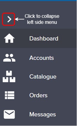
To collapse the side menu, and make the main content area bigger, click on > icon on the top left of the side menu.

Main content area
The main content area contains data retrieved from either your ERP or SalesRep app depending on the menu option you have selected.
